Keys
Keys is an artisan keycap company that believes that a keyboard is an expression of one’s personality and individuality. Therefore, they aim to create functional yet appealing pieces that are unique and representative of their customers. Using high quality materials, they offer a wide range of keycaps, each with its own flare. Keys is an online business only and ships their products to its customers. This company was in need of a new visual identity system that is reflective of the company, as they provide their own customers with products that suit them. Packaging and some other branded materials are also needed, along with a variety of media.
Brand Identity, Visual Identity System, Product Design, Industrial Design
Design Question
How might we create a visual identity for Keys that will be unique to them and translates well into a variety of media?
Deliverables
Visual Identity System
Website
Merchandise
Print Materials
Social Media Graphics
Keycap Designs
Goals
Develop brand recognizability
Create a social presence, as that is how they interact with their customers and sell product

A Technical Logo
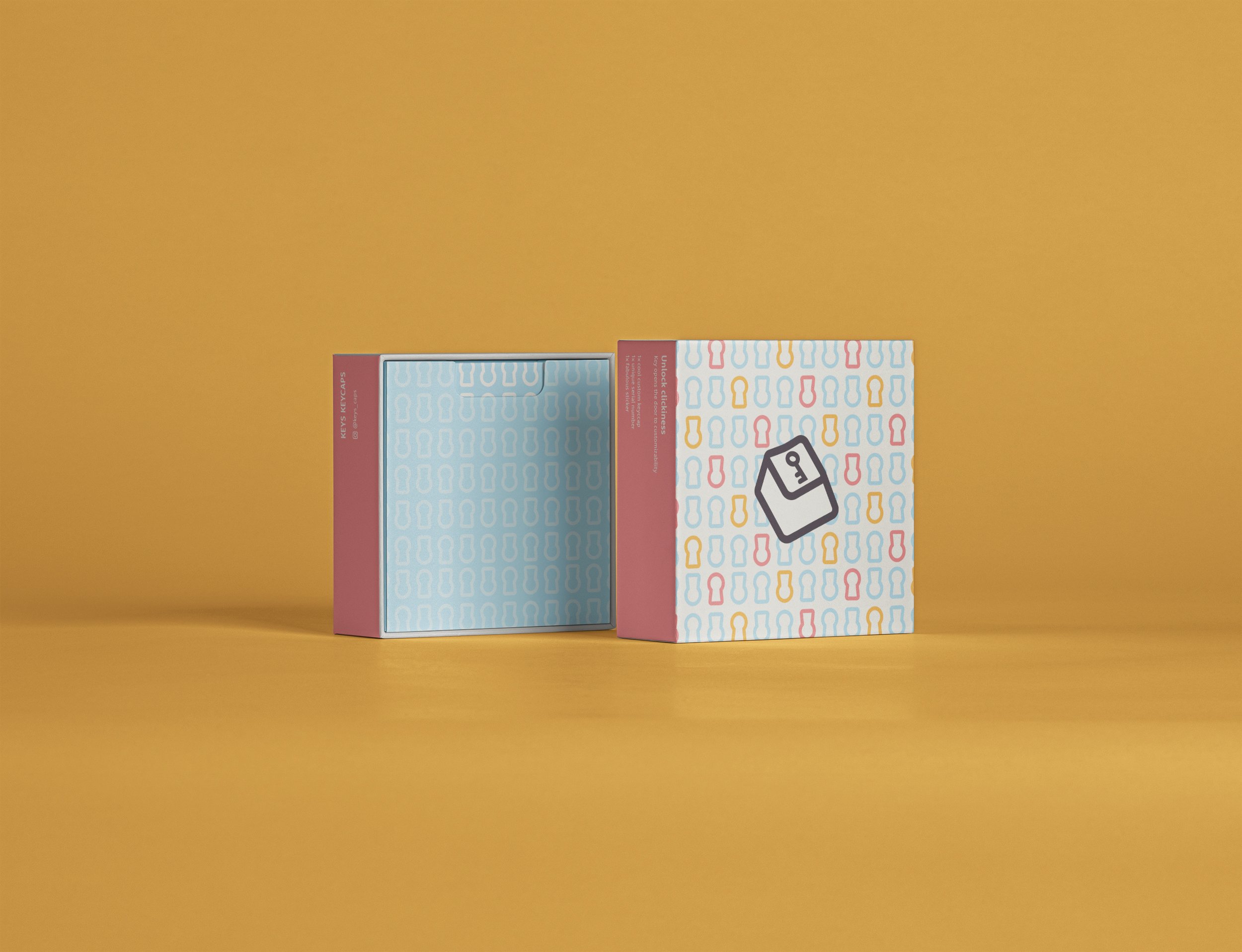
As keys is a keycap brand, I wanted to highlight what the brand was about through the logo. I created an outline of a keycap with a key to represent Keys. The drawing is quite technical as the product Keys creates is quite technical and mechanical.

A Bright Identity
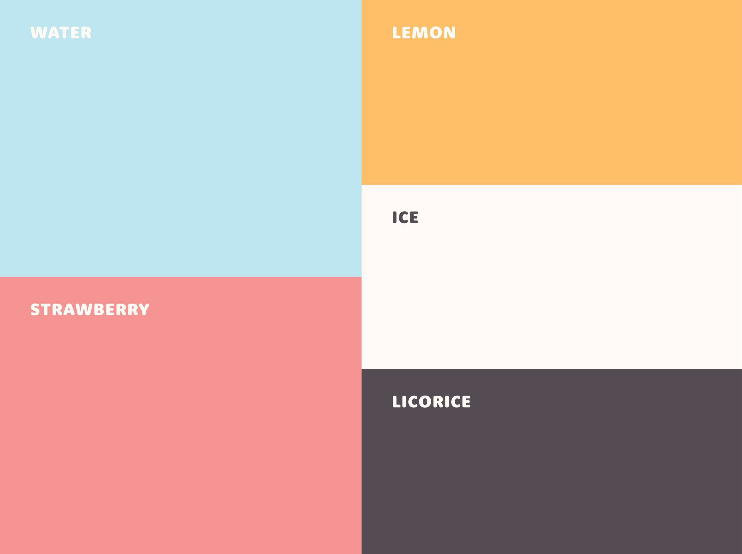
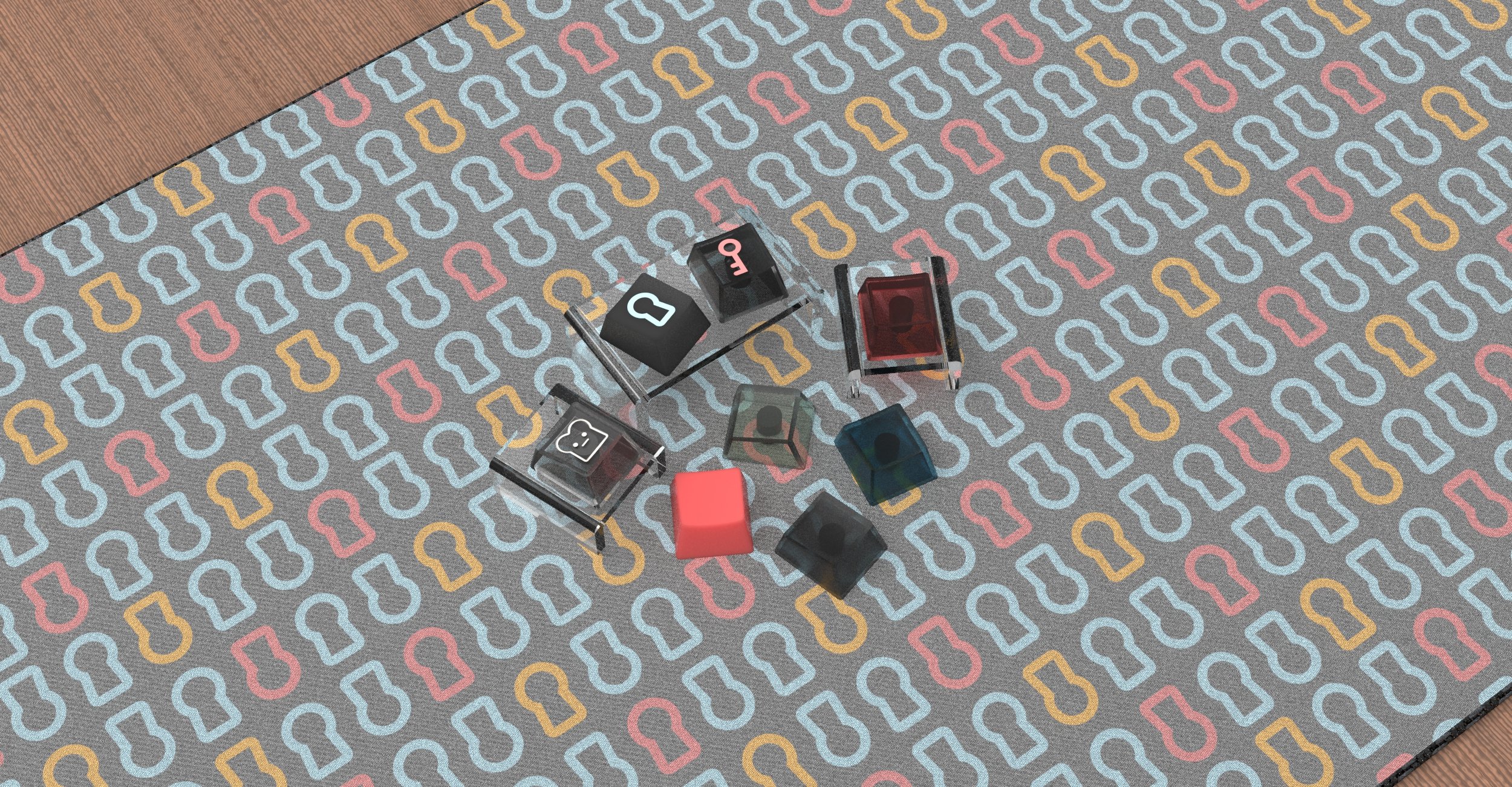
The keycaps created by keys are unique and bright, so to highlight that I wanted to use colours that would stand out. The colours also work with the logo to add a playful aspect, contrasting the technical look of the logo. This is to add an element of playfulness to the brand. The patterning is based on locks as I wanted it to seem like the customers unlock a new experience every time they buy a product from Keys.
A Friendly Type
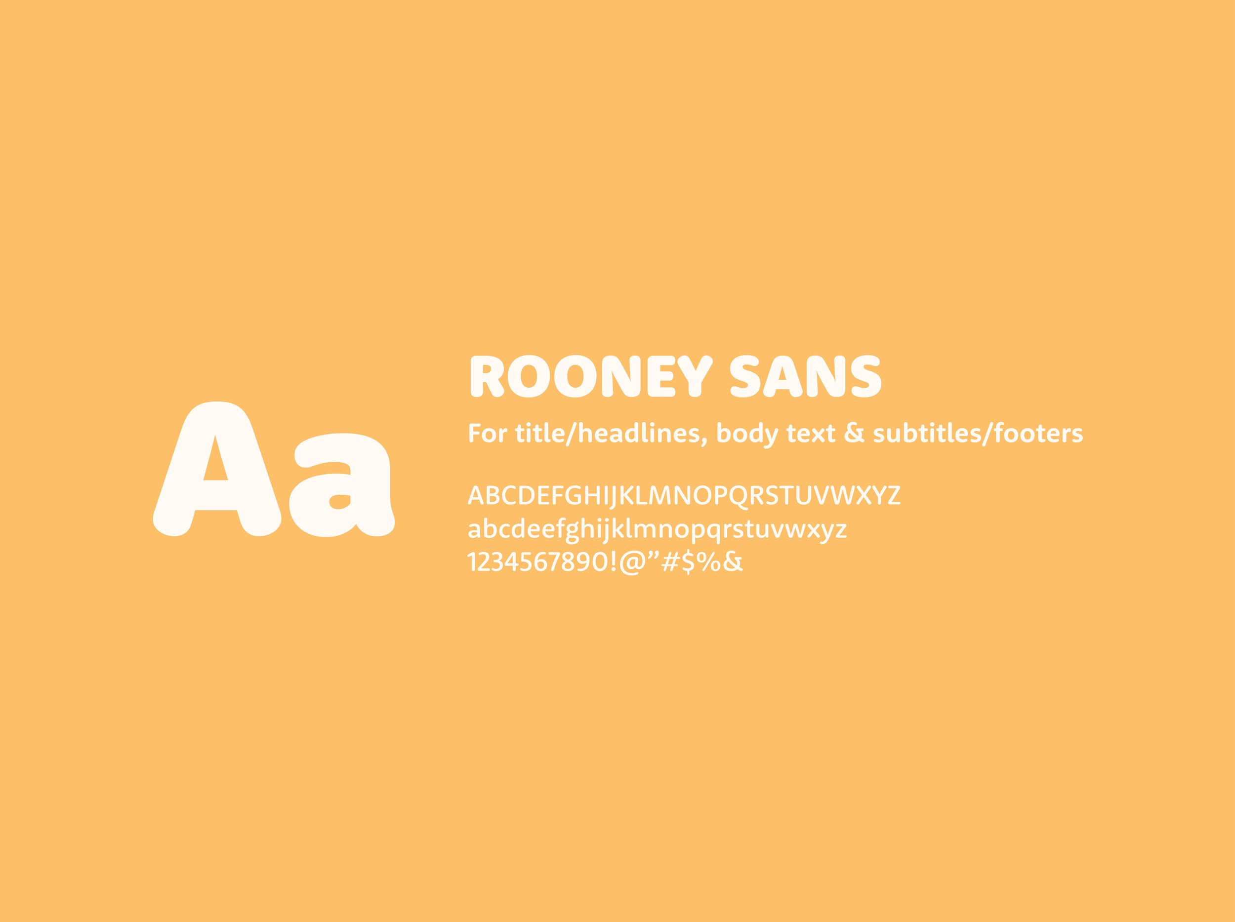
To add contrast to the logo, I wanted the typeface to feel warm and inviting. Rooney Sans was chosen for its unique rounded look. This typeface also works for titles, body texts, and subtitles as it is quite versatile.


Reflection
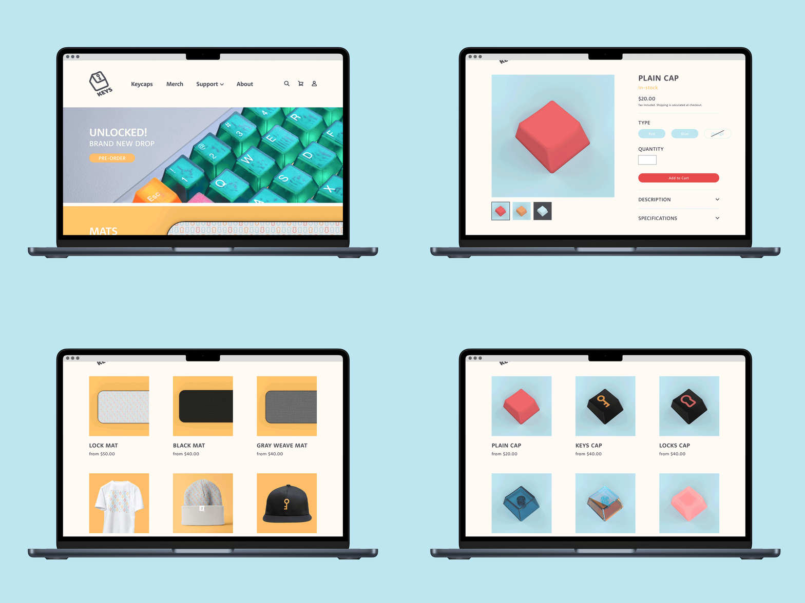
It was difficult designing for a brand that is only represented online, along with thinking about what this company would need created to succeed. The visual identity was incredibly fun to create, and designing the keycaps was also quite fun. I wanted to create a system that would work seamlessly online and I think this was quite successful.
