Alberta Legislature Grounds Wayfinding
The Alberta Legislature stands as an icon representing Alberta. It is beloved by Albertans and tourists who come to visit this beautiful destination anytime of the year. The grounds surrounding the Legislature is extremely complex and used by a wide variety of patrons. At the heart of the grounds, the legislature building stands, surrounded by beautiful green spaces, historical sites, professional buildings, art installations, and a transit center. Winding paved pathways connect all these spaces together. While working there, I noticed a problem. The wayfinding system of the Legislature was inconsistent, with different signage varying from the late 70s mixed with the modern system of the Federal building, each relaying conflicting information. Visitors to the grounds were often confused and lost, while office workers are often confused as to where to go to attend meetings. Beautiful memorials and installations were oftentimes overlooked as patrons did not know they existed at all, while recreational areas were difficult to locate. Temporary sandwich signs littered the grounds, giving more conflicting information while looking unprofessional, deterring from the beauty of the grounds and architecture.
Wayfinding System, Visual Identity System, Map Design, Information Design
Created with Jasper Malo & Stephanie Ng
User Types and Paths
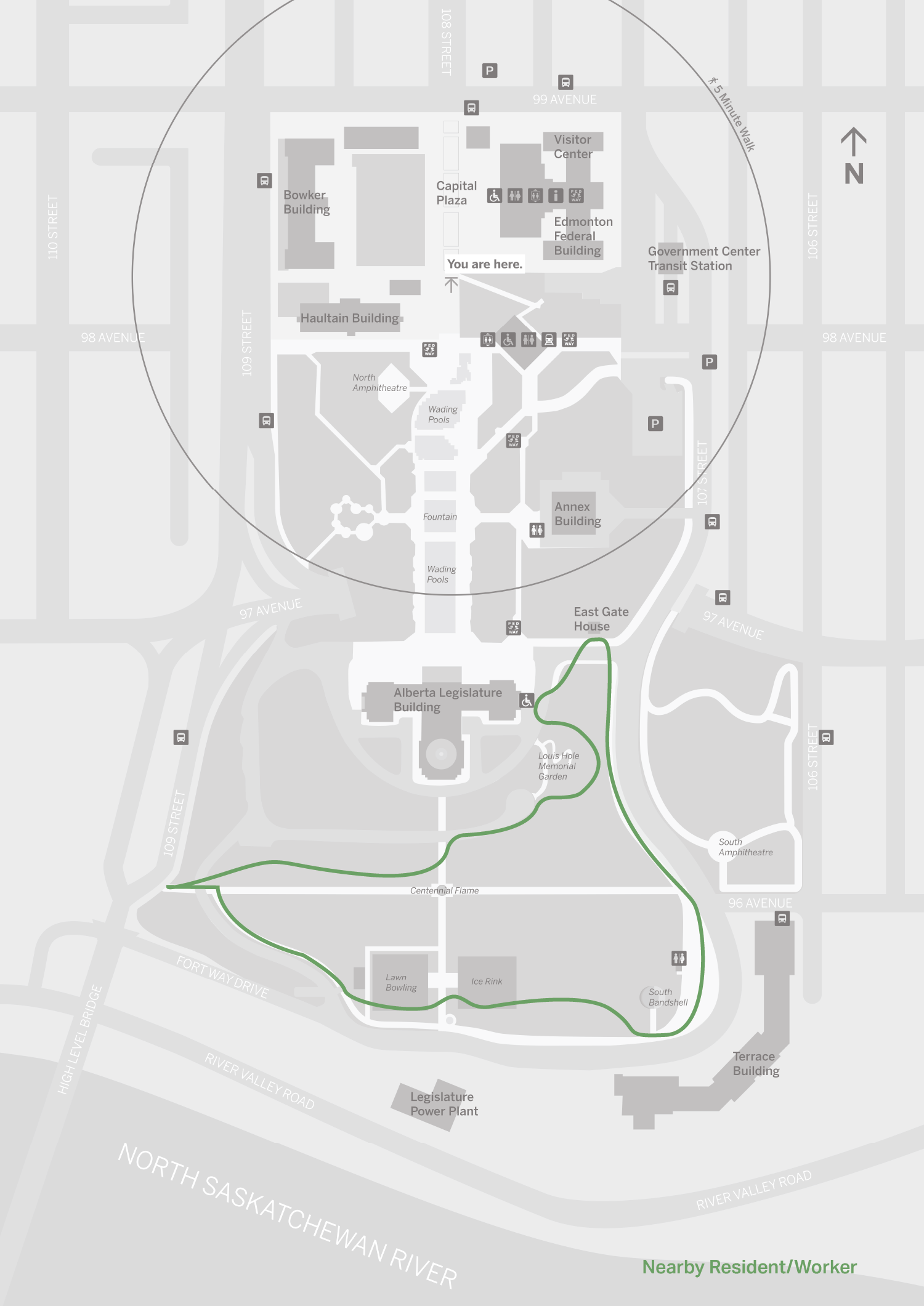
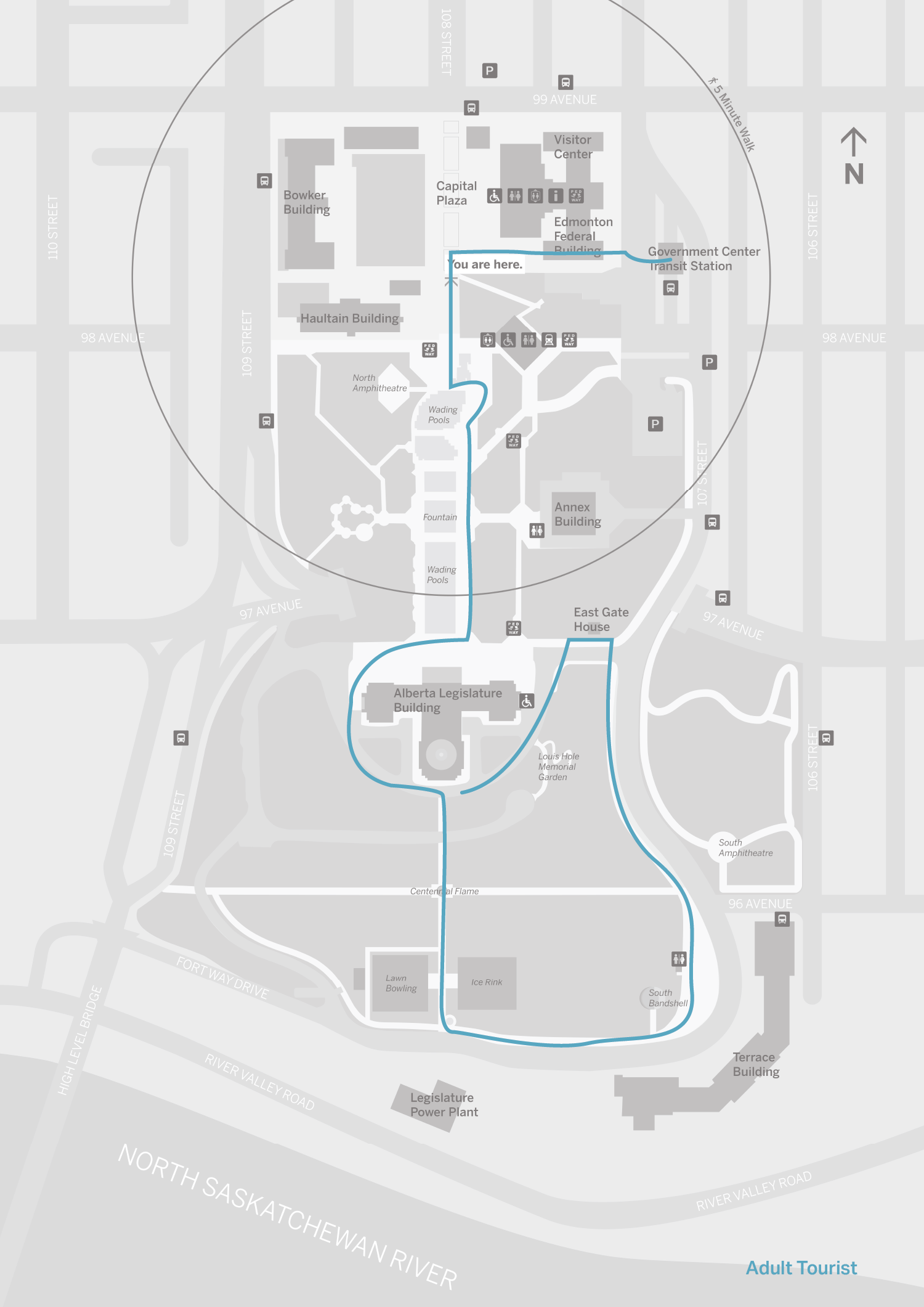
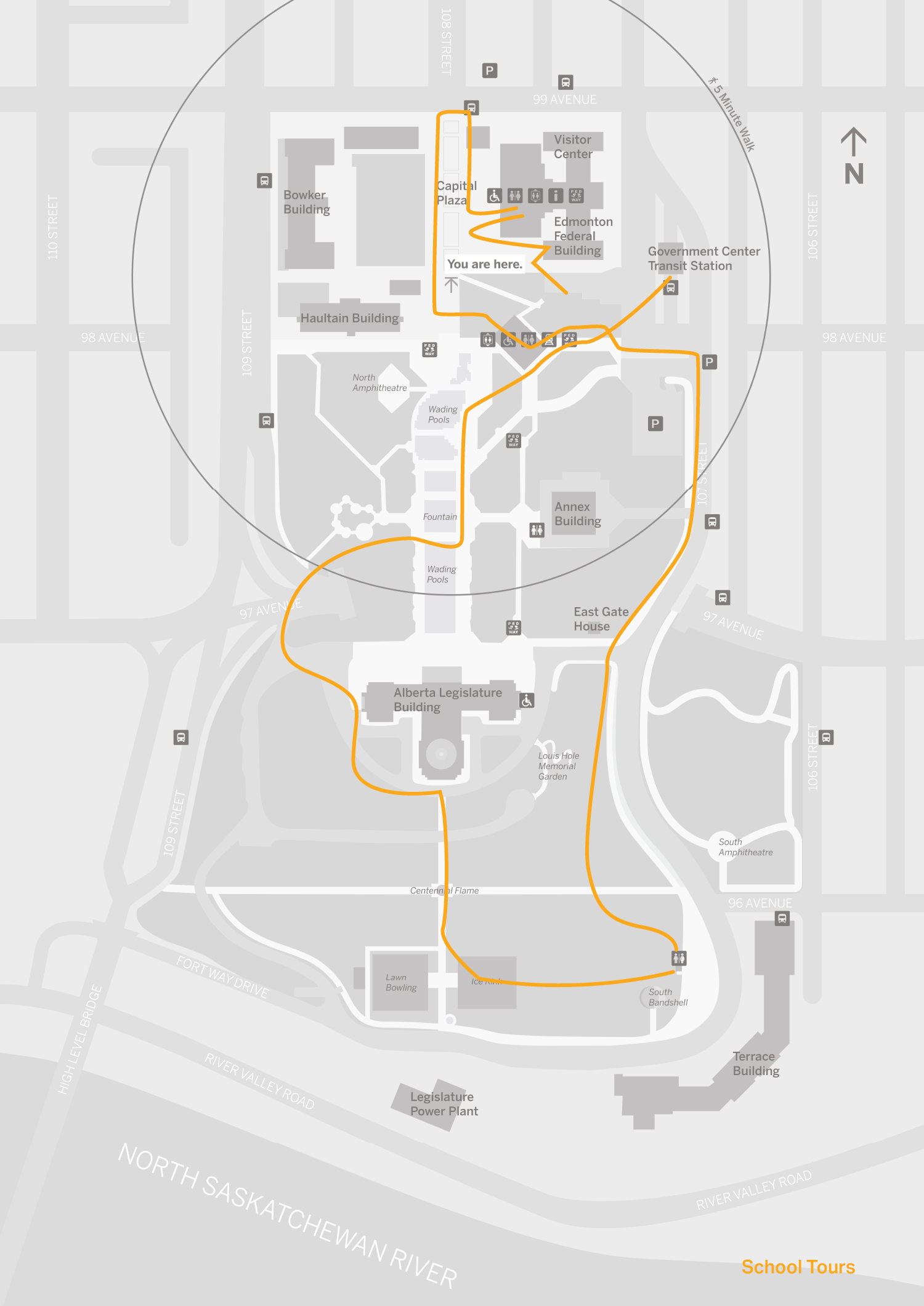
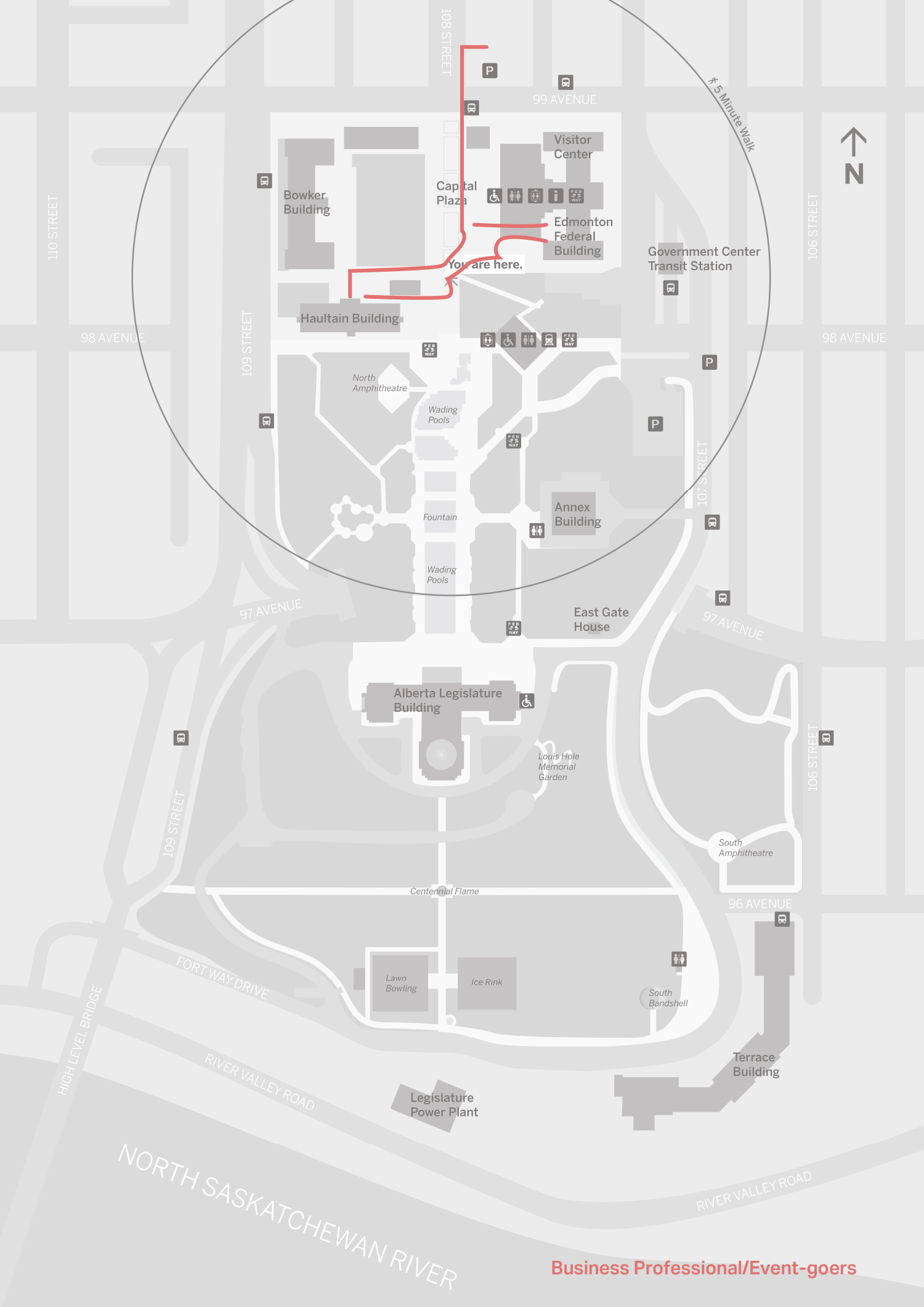
Condensing the Legislature ground’s broad user base into 4 user groups, we learnt that each group had a specific way of getting to the grounds, entry points, time constraints, and goals. These maps above show the typical journey of each user group. Using this information, we used this analysis to decide where various types of signs are needed to best serve the users who need them, pictured below.
Main Objectives
Consolidate the multiple visual systems seen in the area into one new system
Give an impression of authority, heritage, and Canadian culture to all who use the space
Create materials not currently available on site: a directory and a map
Placing both a directory and map at key decision making points (parking lots, main walking entries, LRT entrances)
Label art installations on the map, so people can seek them out intentionally
Create a permanent signage solution to replace the transient sandwich boards dotting the area

Colour Palette that Represents Alberta
Alberta’s official provincial colours were used to create a visual identity that felt like Alberta. The deep, royal blue and golden yellow represent our vast skies and rolling golden fields. Secondary colours were taken from Alberta’s official guidebook, each representing a part of our provincial crest.
A Reflective Type
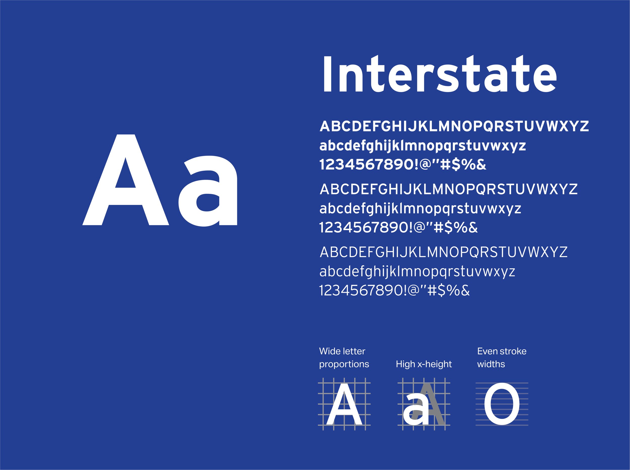
Interstate is the only typeface used across all systems, maintaining consistency and harmony. For signage, it is ideal that the typeface be a sans-serif, have a large x-height, wide letter proportions, and prominent ascenders/descenders to ensure easy readability. Interstate fits all of these points, and is also available in many weights. This allows for creating strong hierarchies of information for users to easily follow. Overall, Interstate is simple, straightforward, and will provide clarity and comfort to users.
Materials
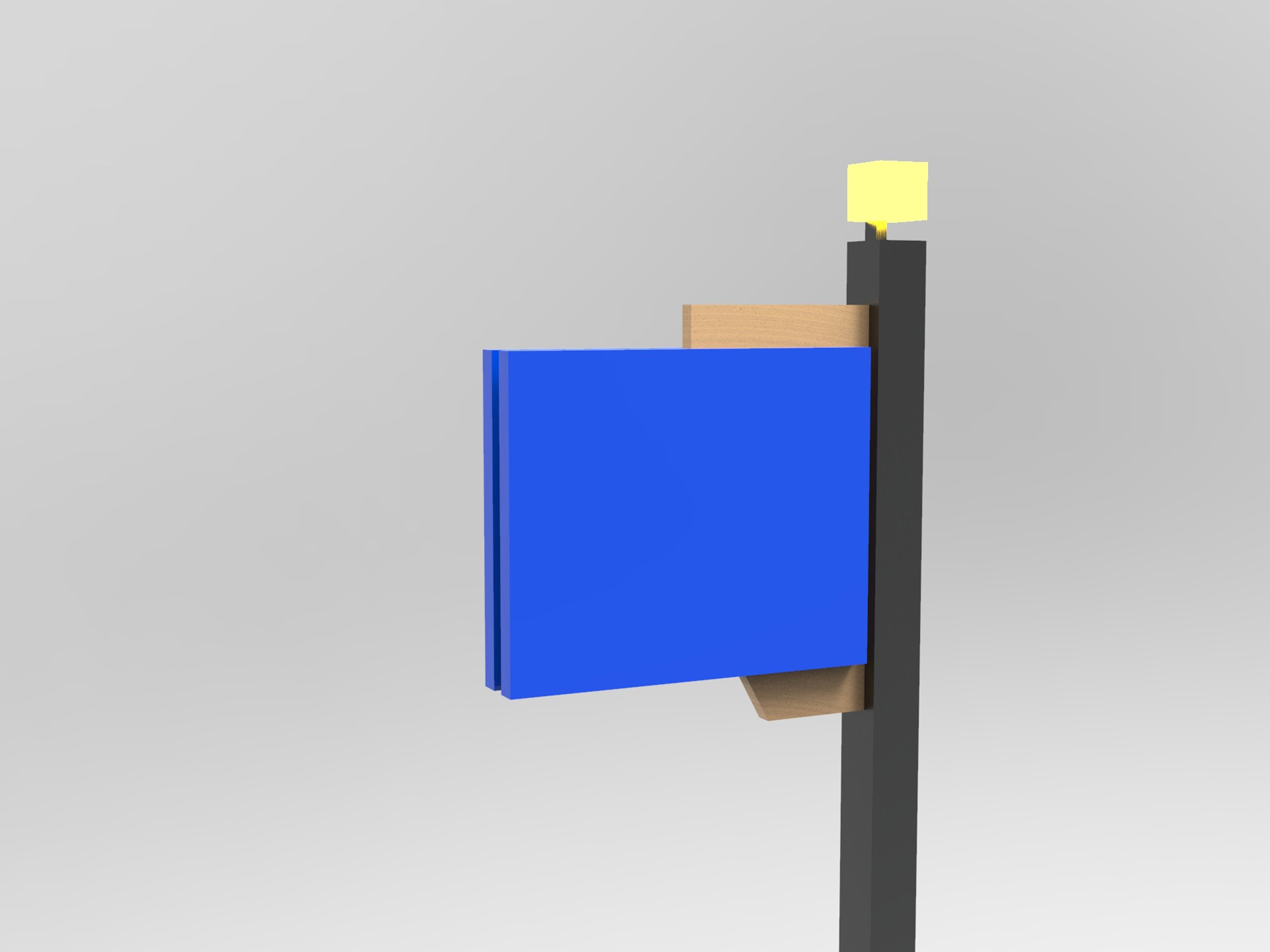
With the wayfinding being situated outside, we had to choose materials that would last outside.
Blue Acrylic
This material provides contrast with the texture of wood. The colour is eye-catching, and will draw people to the various signs. Acrylic will also last for a long time in outdoor conditions.
Pine Wood
The Lodgepole pine tree is Alberta’s official tree, so it was symbolically appropriate to use it on the signage on the Legislature grounds. From research, we learned that using natural materials in outdoor spaces is pleasing to users. The light grain also makes it suitable for displaying text, if needed.

The Map
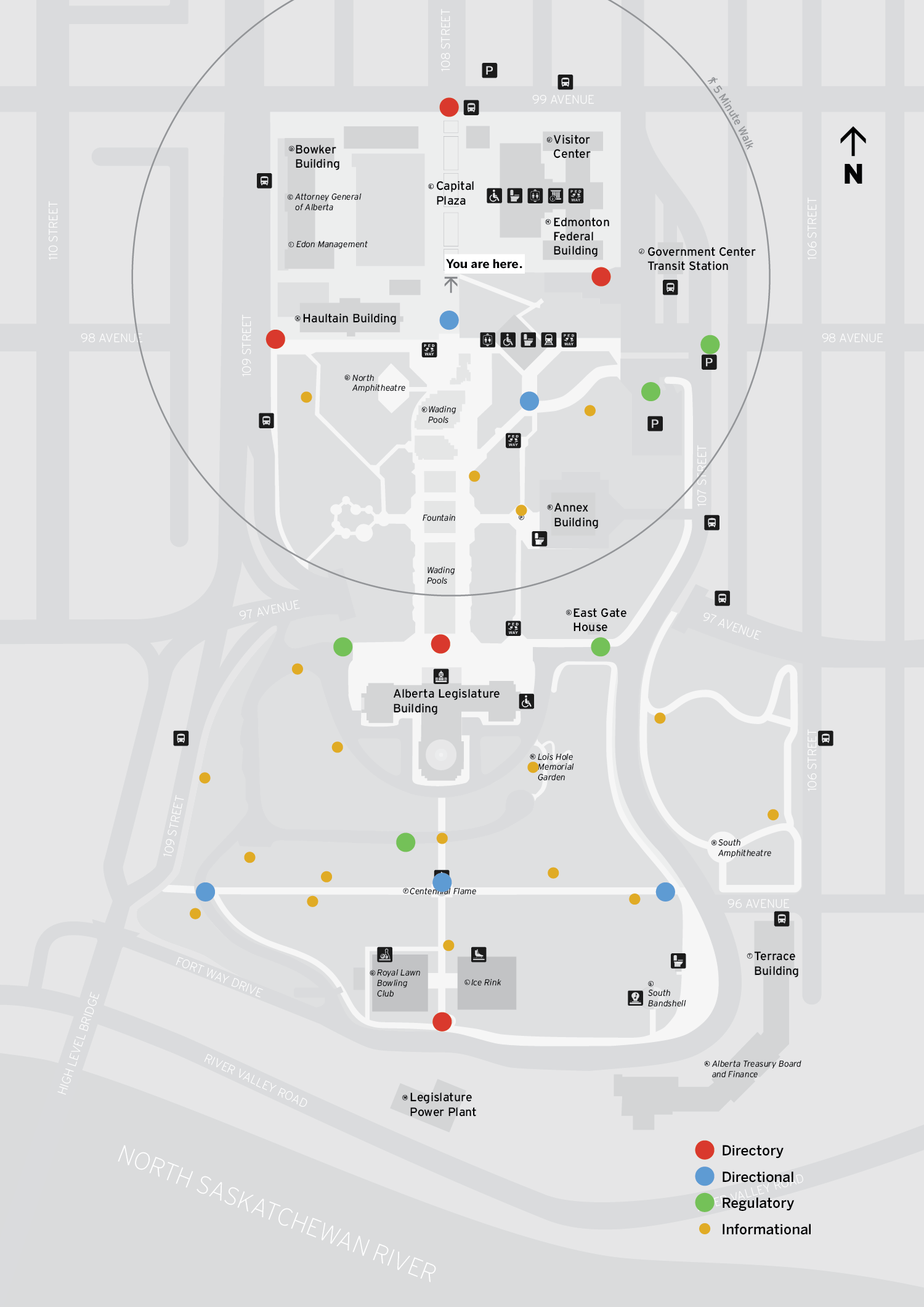
The Alberta Legislature currently has an outdated map on their website, so a new, updated map was created. With inspiration from Legible London, this map features a new set of icons, a walking circle, and points of interested highlighted with colour, while other parts are a neutral gray. Icons will help users gain an understanding of what is in the area, and what amenities different buildings have at a glance. Sculpture and memorial pieces are highlighted on the map with a star to encourage visitors to visit these points of interest. Pedway icons are strewn throughout to show the entrances to pedways where visitors can go to the LRT. Special areas on the map have unique icons, such as the Royal Lawn Bowling Club.
Contrasting colours helps distinguish points of interest. Buildings are highlighted in yellow to give emphasis in case office workers need to find a building quickly. Green spaces are highlighted in green, bodies of water are blue, and the roads are gray. Fountains, being a main attraction, are a lighter shade of blue.
A location marker was created with a red arrow highlighted with a “You are here”. This is so users can orientate themselves at a glance. The arrow points towards the direction the user is facing for readability. Around the location marker, a 5 minute walking circle was created to help users understand the context of their surrounding and have an approximate time estimation to certain areas.

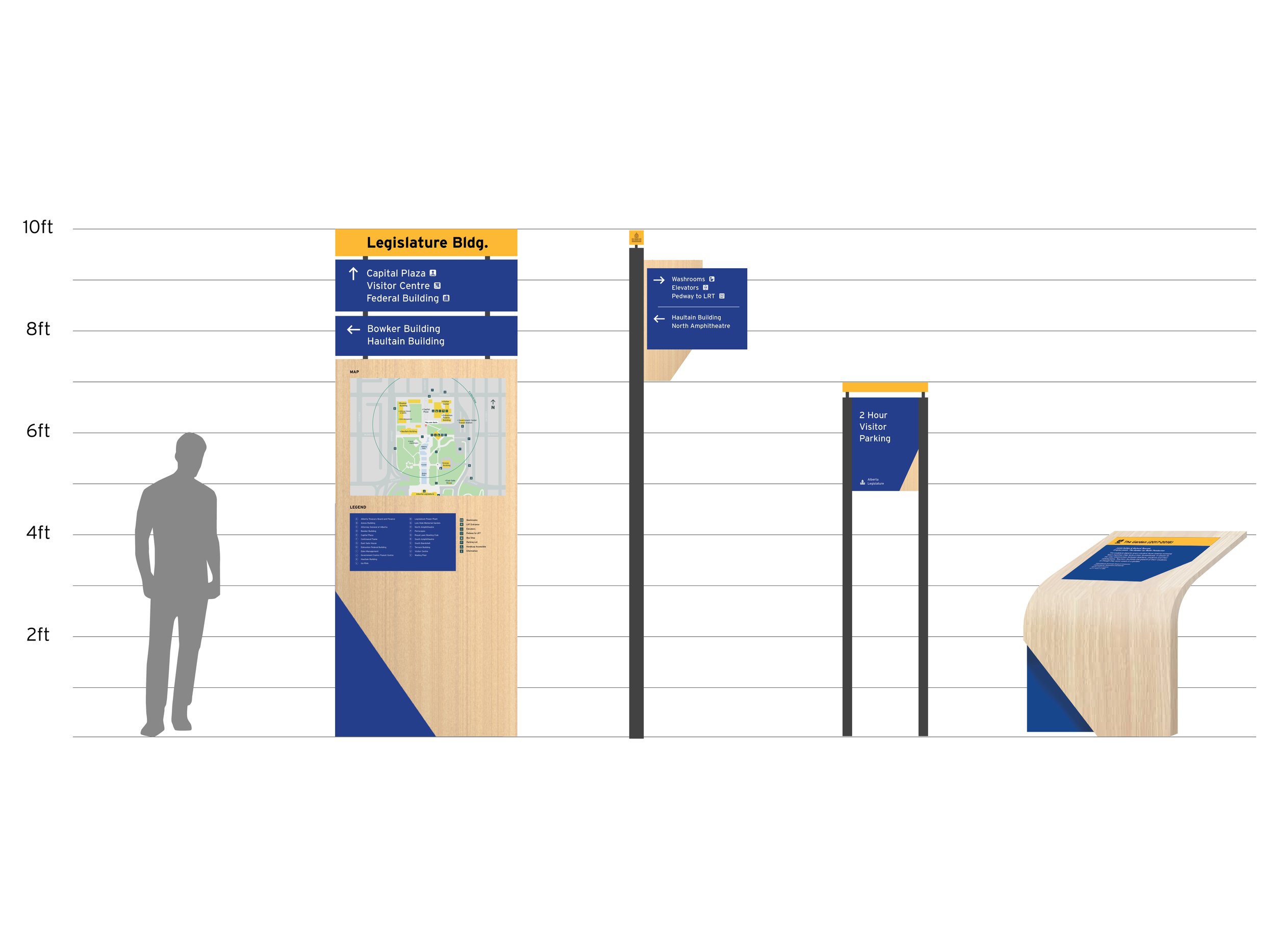
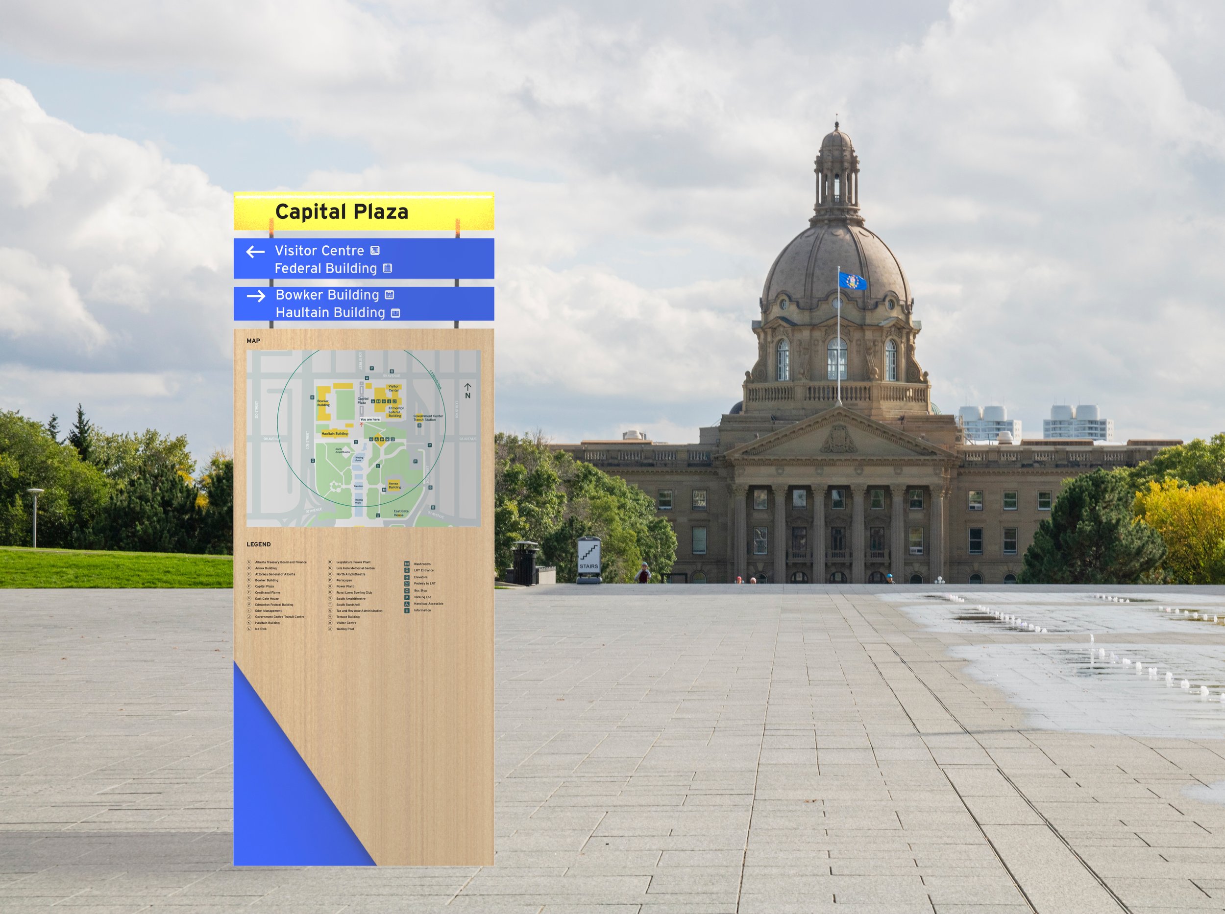
The Directory
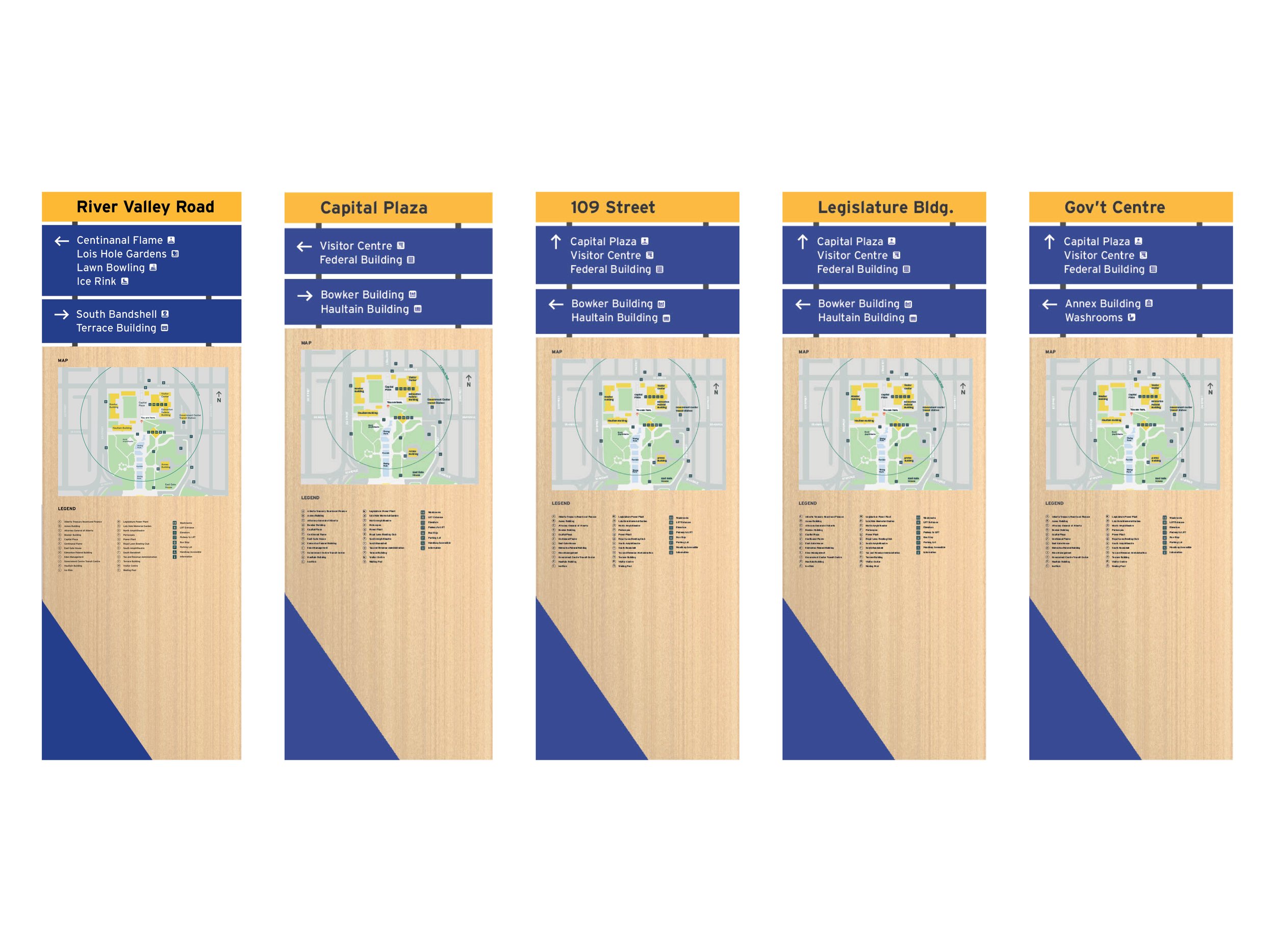
Displays exterior map of legislature grounds, orientation and information for visitors
Content
Directional arrows and icons pointing towards key destinations and pathways, map, and a legend
Mounting
Panel mounting
Dimensions in Inches
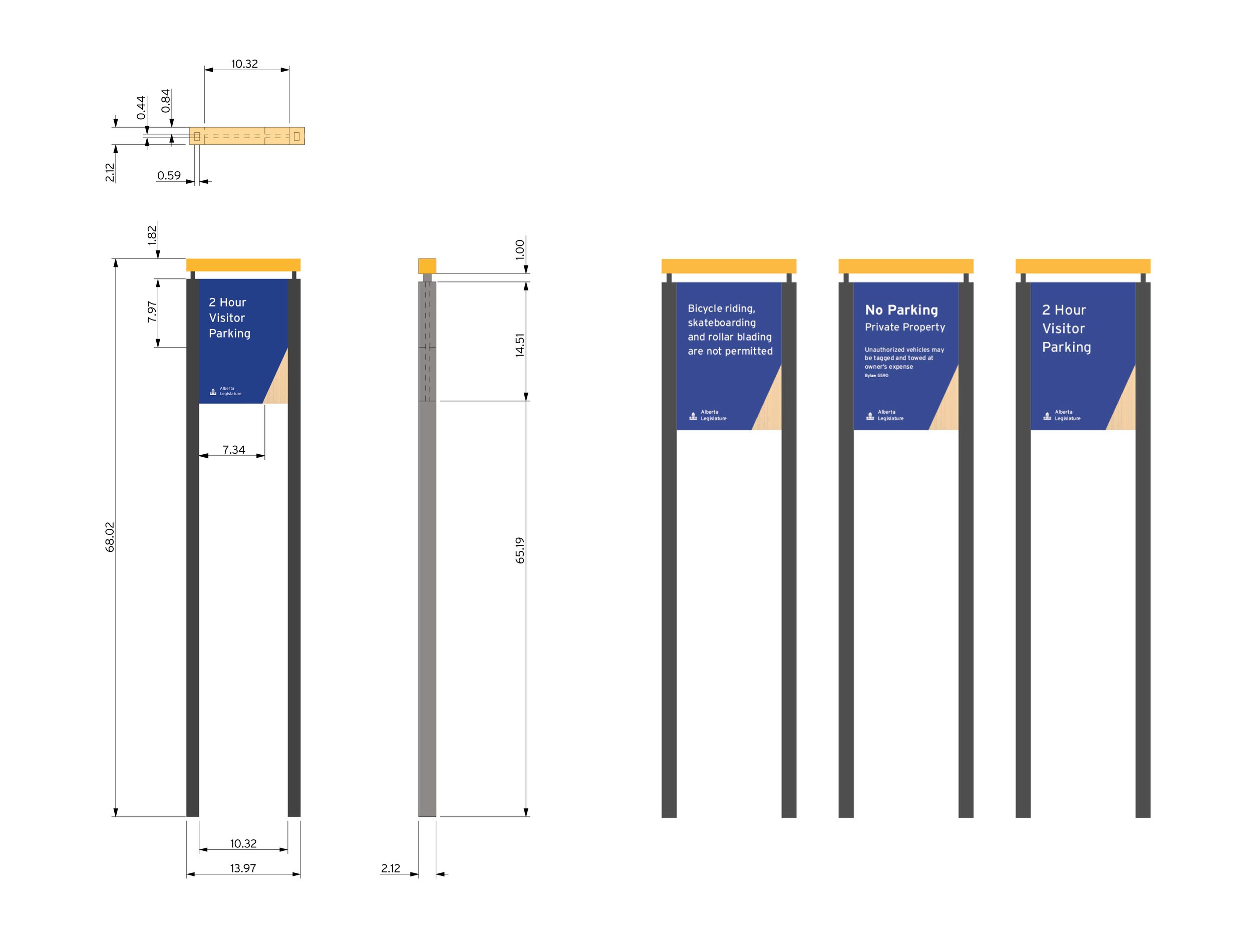
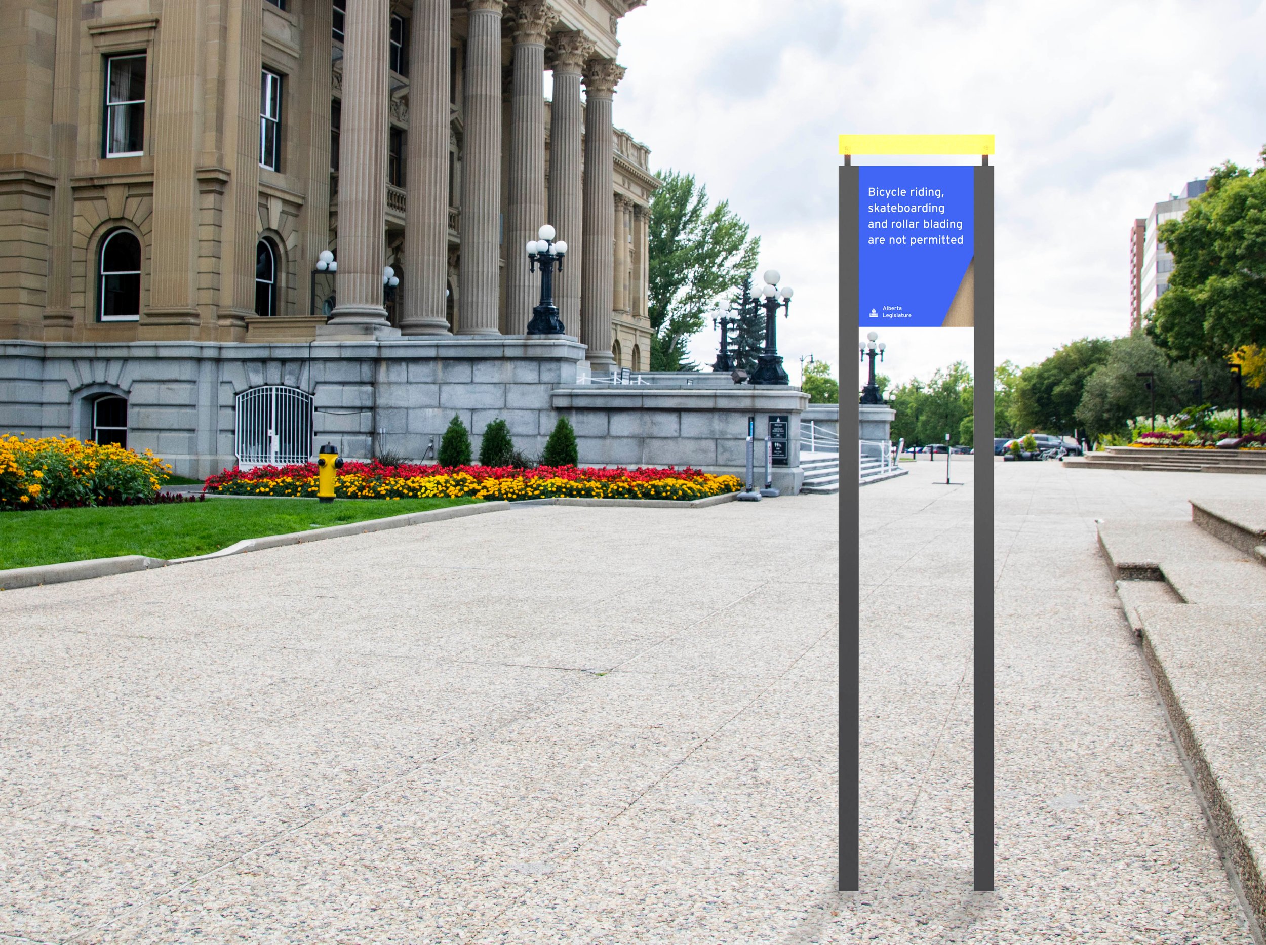
Regulatory Signs
Provides information about regulations that patrons to the grounds has to follow
Mounting
Bottom of sign to floor should be at least 50”, may vary depending on site conditions and landscaping.
Dimensions in Inches
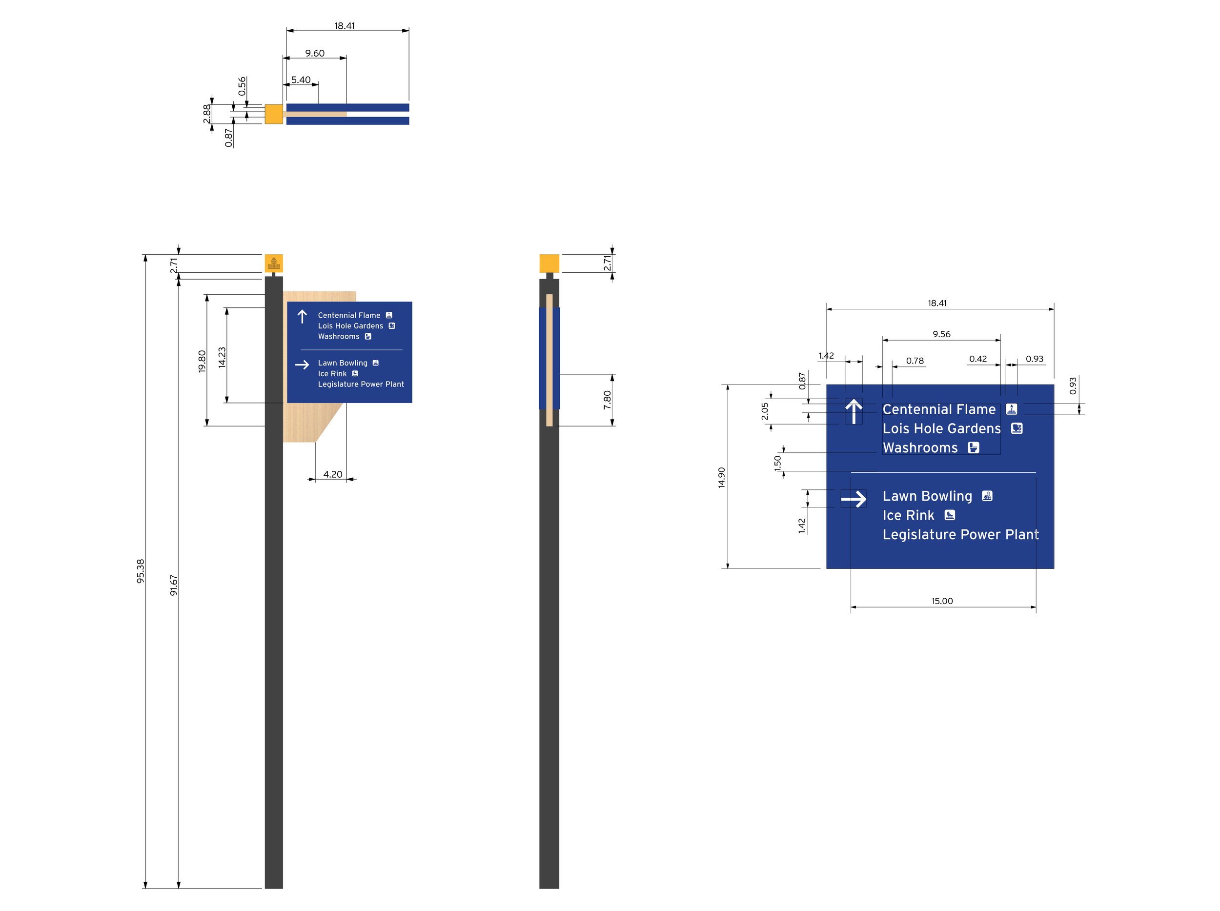
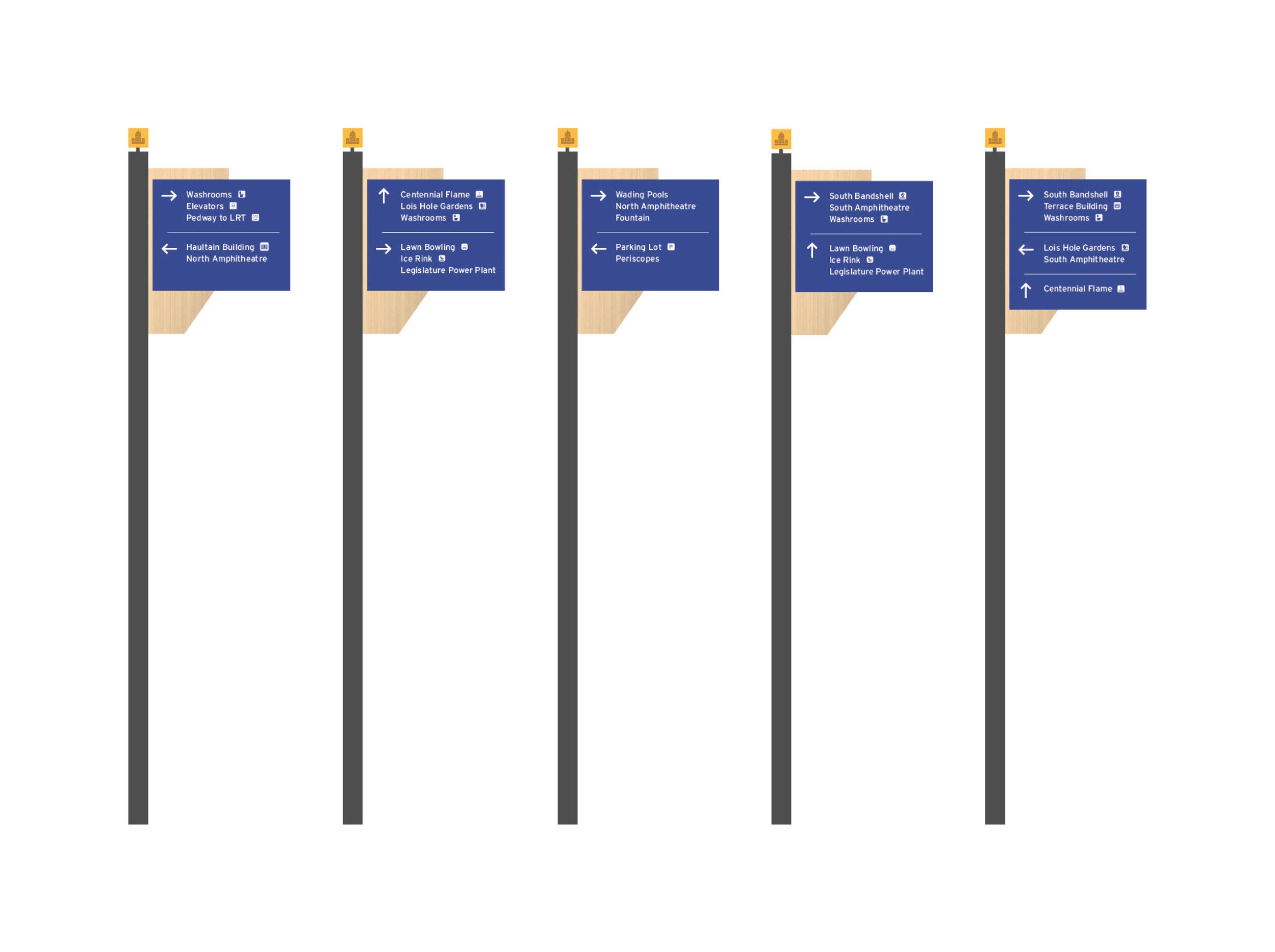
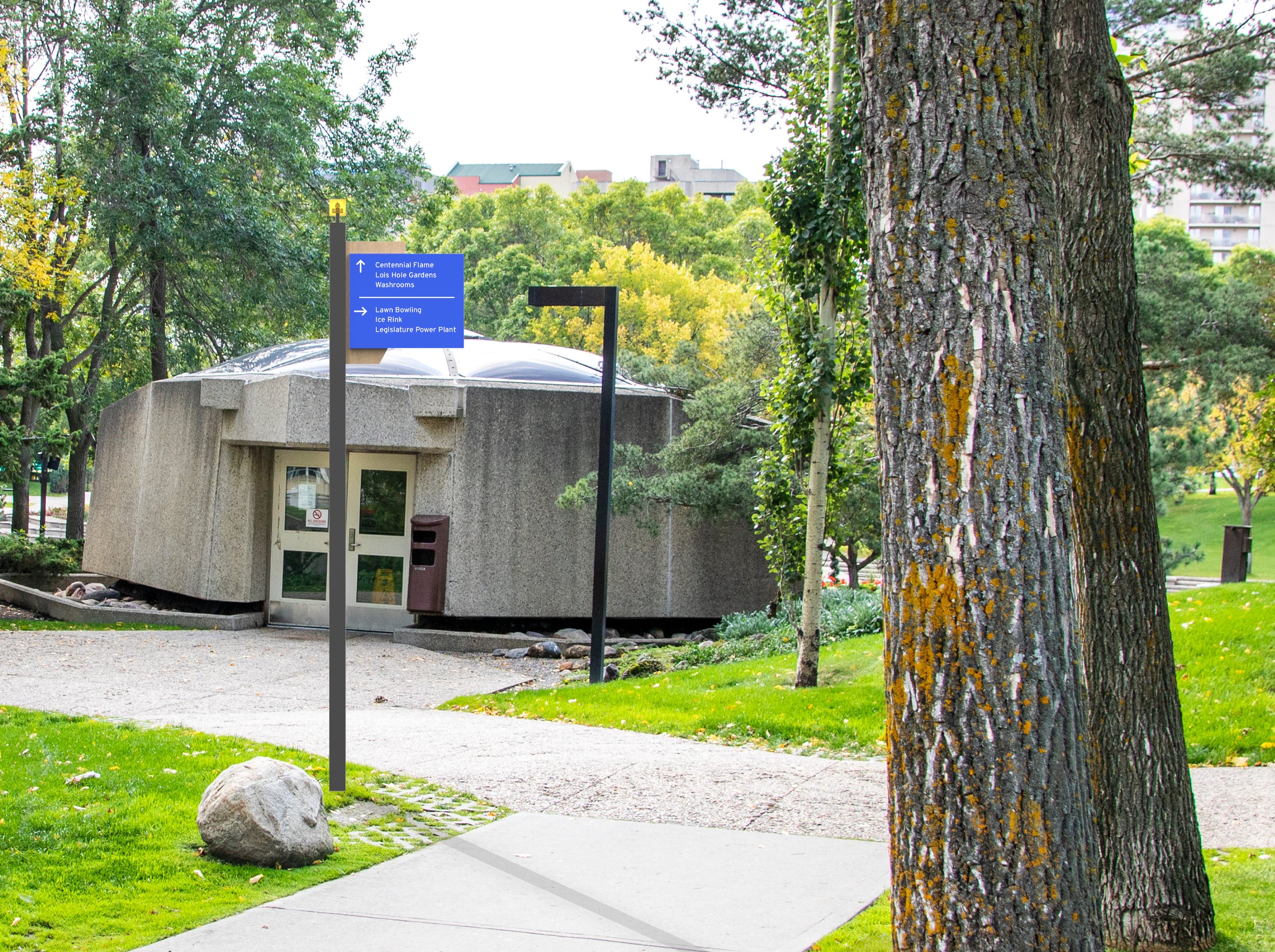
Directional Signs
Exterior wayfinding directional signage
Content
Directional arrows and icons pointing towards key destinations and pathways
Mounting
Bottom of sign to floor should be at least 65”, could vary depending on site conditions and landscaping.
Dimensions in Inches
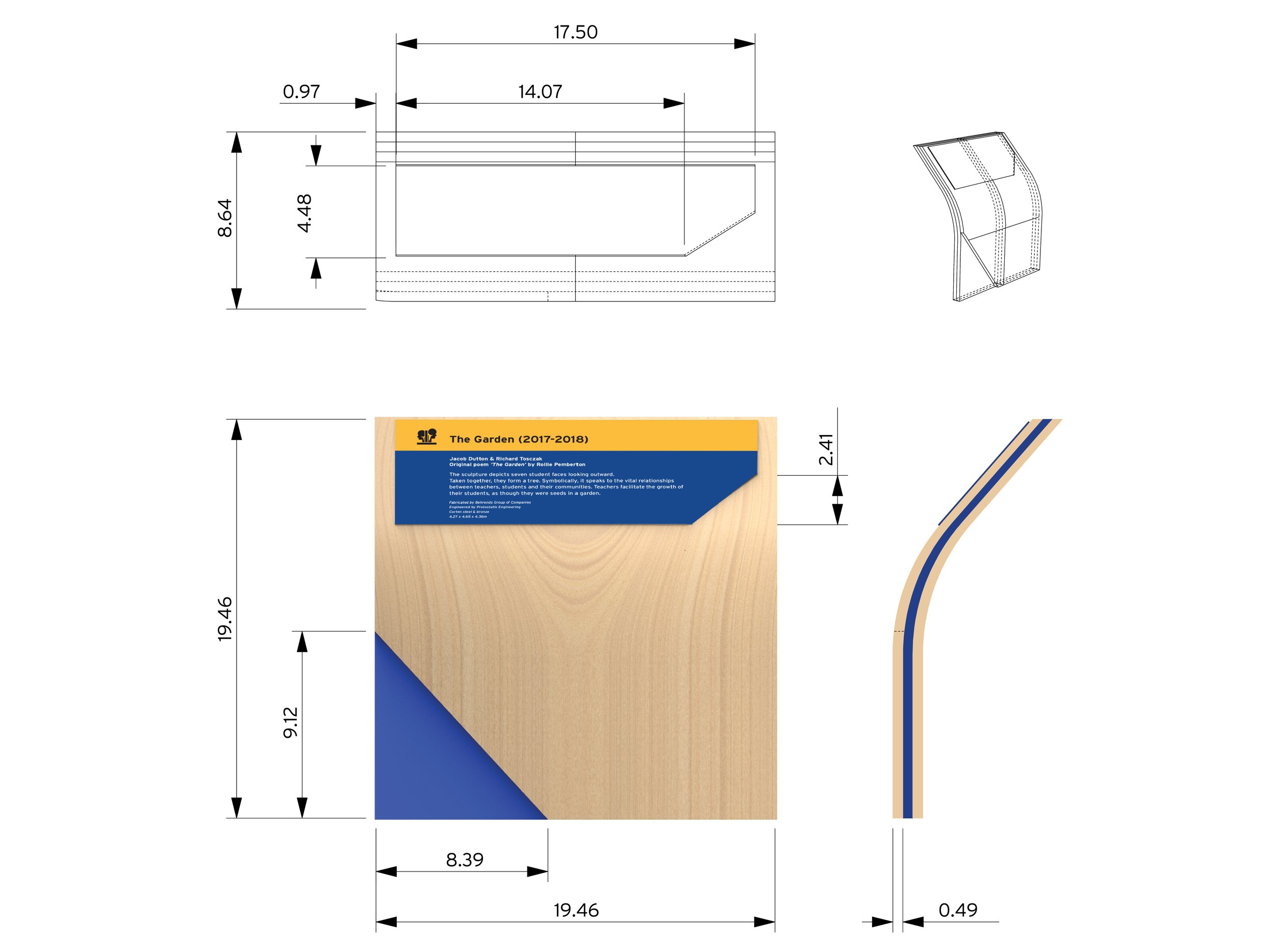
Informational Signs
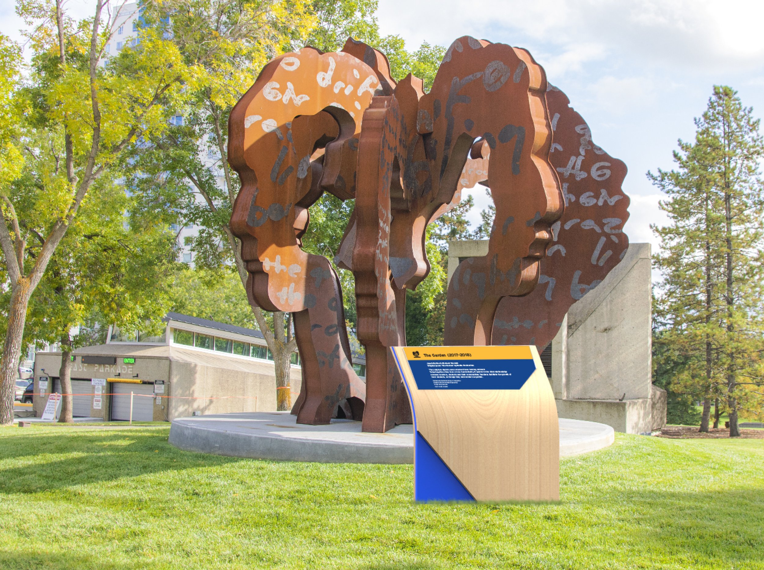
Exterior informational signage detailing various art installations and historical sites
Content
Plaque on the center of signage detailing background context behind various art installations and historical sites
Mounting
Panel mounting
Dimensions in Inches
Reflection
This project looked at wayfinding in different spaces, and how the current systems could be improved. For this group project, we looked at the Alberta Legislature grounds, an area where I personally have worked at. The grounds itself is beautiful, especially during the spring and summer, however I found that the wayfinding around the grounds takes away from the legitimacy of the place, especially since it represents Alberta’s government. Currently, much of the wayfinding that exists at the Legislature grounds does not represent the space well and is definitely not inviting as it almost shows chaos rather than a place of government.
Through this project, I have learned that wayfinding is not only creating a coherent and consistent visual system, but also an excessive amount of planning and organization. Often times, wayfinding is overlooked as just “signage” and ignored but there is a lot of planning that goes into deciding the most appropriate place to put the signs and what type of sign is relevant for a certain space. Alongside with the planning, there needs to be intent when creating the coherent visual system to go with the signage. In this case, our group looked at what represents Alberta, from the colours and materials to the design of the sign and icons. Wayfinding is incredibly personal to a specific space and oftentimes is the first piece of branding that users interact with to a space, impacting how the space is perceived.
